Statistics
The Statistics section of the Dashboard is an interactive data visualization tool that provides real-time retrieval and display of current counter values for your application. The chart helps you gain insights into the performance and health of your application by presenting the data in a graphical format, enabling you to identify patterns, trends, and anomalies for better optimization and troubleshooting.
This powerful tool significantly simplifies the tracking of critical and non-critical metrics. The data projection mechanism allows for effective segmentation and visualization of different counter types related to Memory, Network, API, Threads, CPU, and more.

The Statistics tool allows displaying both Default and Custom counters. Developers are provided with the corresponding functions that allow registering custom counters in the Game Carrier. Once the custom counter is registered, the server will automatically push the collected data to the Game Carrier where it will be displayed in the Statistics section. This logic applies to the default counters as well.
Below is a screenshot illustrating the breakdown of the Statistics section into distinct areas. Further descriptions for each area within the section can be found below.
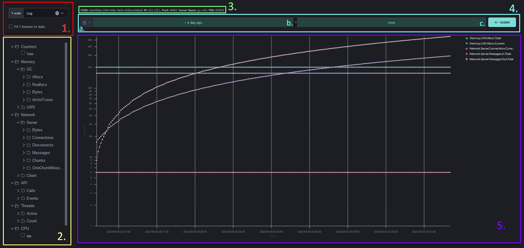
- The Y Scale also known as the Y-axis chart, is a graphical representation of data where the vertical axis (Y-axis) represents the values or measurements being plotted. The chart supports two types of data projection: linear and logarithmic. By default, the logarithmic projection type is selected. However, if you need to switch to linear projection, you can easily select it from the dropdown menu.
Fit Y domain to data setting refers to adjusting the Y-axis scale of the chart to fit the range of the data being displayed. When this setting is enabled, the Y-axis scale is dynamically adjusted based on the minimum and maximum values of the data, ensuring that the entire range of data points is visible on the chart. This can be useful when the data values vary greatly, as it allows for a more accurate and comprehensive visualization of the data.
-
The Counters Selection menu provides a comprehensive tree structure that organizes all available counters in the application. This tree structure allows you to navigate and select specific counters based on their categories and subcategories. By grouping the counters, the menu enables easier management and organization of your monitoring and tracking capabilities. Once the counters from the menu are selected the corresponding data will be plotted on the chart.
-
The Server Info provides current server information such as Universally Unique Identifier(UUID), IP Address, Port, Server Name and Server’s Process ID(PID).
-
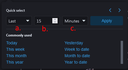
The Date and Time Range setting allows users to select specific dates “from” and “to” in order to view data that occurred during a specific period. This subsection is divided into three areas, where you can specify the required period of time. The (a.) area allows for quick selection of the date period, overriding the (b.) and (c.) settings. The (b.) and (c.) areas allow you to specify the time period as “from” and “to” respectively.
-
The Chart displays real-time information about various metrics and counters related to the performance and behavior of your application. On the right side of the Chart area you can find the list of the currently selected counters whose data is being projected onto the chart.
When a specific set of counters is selected from the Counters Selection menu, their names will be displayed next to the chart, and the corresponding data will be projected onto the chart.